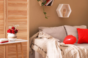
Color matching plays a vital role in creating a pleasing living environment.
The choice of colors is influenced by various design styles. Understanding color ratios is fundamental.
Designers in the realm of soft furnishings adhere to the 60:30:10 rule. This rule prescribes that the primary color should occupy 60% of the palette, the secondary color 30%, and the accent color 10%.
When it comes to choosing a color scheme, two primary options exist: complementary and analogous.
Colors that complement each other are positioned at opposite ends of the color wheel, like red and green or blue and orange. These pairings inject energy and vibrancy into a space.
In contrast, analogous colors, like yellow and green or blue and purple, create harmony through their similarity.
In contemporary design, the use of black has become increasingly popular, albeit in moderation. Black can add a sense of cleanliness and contrast to a room, making it more visually appealing. Integrating black sparingly, such as through a black chair or vase, can create a striking focal point.
A smart interior design approach is to identify a standout element within the space, even if it's just an accessory. This focal point can be either colorful or black and white.
To achieve a cohesive look, select other colors based on the standout element. For example, if you have vibrant red pillows, incorporate shades of red elsewhere to maintain visual consistency.
Creating color continuity throughout your living spaces is a well-known technique. Repeating a particular color in various items and rooms fosters flow and cohesion. For instance, you can use the same shade of white in both your bedroom and curtains to unify the entire space effortlessly.
Contrasting colors, or chromatic contrast, impacts the formality of a space. Strong color contrast lends formality, making it suitable for areas like the living room or dining room where social interaction occurs.
In contrast, a smaller color difference creates a more relaxed atmosphere, ideal for spaces like the bedroom, where tranquility is paramount.
Colors can significantly influence our emotions and psychological well-being. In interior design, colors serve multiple functions: enhancing visual appeal, regulating emotions, adjusting indoor lighting, and reflecting personal habits. For instance, blue may evoke feelings of serenity, while yellow can evoke warmth and cheerfulness.
Colors can be influenced by the seasons. Autumn, a transitional period into winter, calls for subdued, calming colors like mustard yellow and brown. These hues create a quiet, cozy atmosphere perfect for bedrooms.
Conversely, spring, a season of growth and renewal, demands vibrant, eye-catching colors like pink and fruity green. These colors infuse spaces, such as dining rooms, with a lively and invigorating ambiance.
Incorporating seasonal colors aligns your living space with the natural rhythm of the seasons, fostering a sense of harmony and connection with the world outside.


