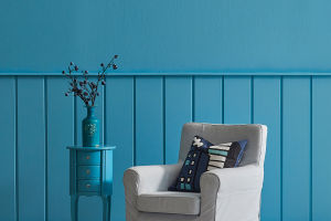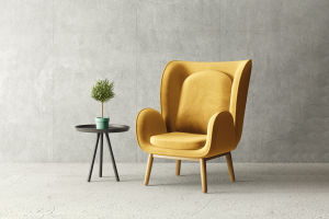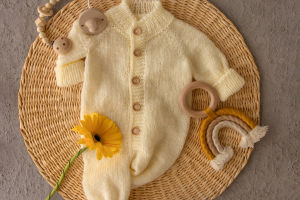
Colors and patterns play a crucial role in any interior design project, visible on textiles, walls, tiles, and furniture.
Their proper coordination infuses energy, creates visual movement, and adds texture to a space.
The Art of Balancing Colors and Patterns
Dear Lykkers, decorating with colors and patterns can be powerful yet challenging without theoretical knowledge. Striking the right balance ensures a visually pleasing and functional interior.
Decorating Interiors with Colors and Patterns
Incorporating Colors and Patterns
Incorporating diverse colors and patterns requires understanding key interior design principles. These include selecting a color palette, balancing warm and cool tones, and harmonizing proportions to evoke desired emotions.
Principles of Color Selection
Colors can reflect various moods:
Reds and yellows convey passion and energy.
Greens and blues bring tranquility and peace.
How to Apply Color Matching in Interior Design
Defining the Color Palette
Color schemes guide the creation of a cohesive palette:
Monochrome: A single color in varying shades for a consistent design.
Analogous: Combines a primary color with its adjacent hues for softness.
Complementary: Opposite colors on the wheel for bold contrast.
Split Complementary: A dominant color with two adjacent complements for nuance.
Triadic: High-contrast hues forming a triangle on the wheel.
Square: Four equidistant colors creating a bold palette with one dominant shade.
Applying the 60-30-10 Rule
The 60-30-10 Rule is essential for color proportion:
60%: Dominant color for walls, large furniture, or floors.
30%: Secondary color adding interest without harsh contrast.
10%: Accent color for decorative items, allowing bold contrasts.
Balancing Warm and Cool Tones
To create a comfortable ambiance, warm colors (orange, yellow, red) and cool tones (blue, green, violet) must harmonize.
How to Combine Decorative Patterns
Pattern Scale and Balance
Patterns should vary in scale—small, medium, and large—and complement the color palette. Suggestions include:
One large-scale and one small-scale pattern with a solid color.
One large, one medium, and one small-scale pattern with a solid color.
Multicolored Patterns
Choose two or three colors from multicolored patterns to apply in smaller decorative elements like books, lamps, or flowers.
Geometric and Organic Patterns
Combining geometric and organic patterns creates balance. Too many patterns of the same category can overwhelm the design.
Harmony and Balance
Transforming Spaces with Patterns and Colors
Patterns can alter a room’s perceived scale, and colors evoke emotions. A designer ensures harmony by balancing patterns, colors, and materials to meet the intended aesthetic.
Creating a Harmonious Environment
A well-balanced space fosters harmony in life. This principle is at the core of every project, ensuring interiors are both functional and beautiful.


